Red States and Blue States - Live from Coast to Coast
How television networks color-coded the parties on election night
SEP 21 2016
How television networks color-coded the parties on election night
SEP 21 2016
My first memory of a presidential election comes from 1992 (Clinton-Bush-Perot). I was in third grade, and our homework assignment on election night was to color an electoral map as the results came in. Easy enough, right? [And we get to watch TV?]
Well for the last 24 years, I have sworn to anyone who would listen that our homework that night was harder than it sounds – especially if you, like me, were kneeling in front of your aunt’s TV manually flipping between ABC, CBS, and NBC to see whether Peter Jennings, Dan Rather, or Tom Brokaw would be first to call a state.
The difficulty, it turns out, was not in all of the up-and-down or back-and-forth or button pushing. The real challenge for the maniacal eight-year-old channel surfer was that on two of the networks, Republican-won states were colored red, while on the third, they were colored blue (vice-versa for Democrats). [My classmates who stuck with one station presumably had a much easier time than I did.]
The notion that the parties’ colors were so easily interchangeable might sound odd in today’s “red-state, blue-state” America. But our (d)evolution toward hyper-polarized, color-coded orthodoxy – red always equals Republican, blue always equals Democrat – is a fairly recent phenomenon. The New York Times and Washington Post wrote about it during its infancy in 2004; Smithsonian Magazine offered up a detailed history in 2012; and the Washington Post chimed in again last year. All are fascinating reads.
What you won’t find anywhere, however, is a comprehensive summary of the colors used by every major network and cable news station to identify Democrats and Republicans and the states they won. So I went through the footage on YouTube – channel-by-channel and election-by-election[1] – to assemble exactly that:
|
|
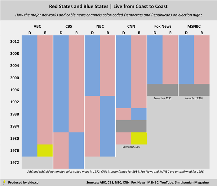
The first major network to use color-coded maps on election night was CBS in 1972, though the maps appear to have been regional. You can see an example here, when Walter Cronkite kicks it over to Roger Mudd for an update on the South. Richard Nixon, the Republican, was blue; George McGovern, the Democrat, was red. [Incidentally, 1972 was the first year that a majority of U.S. households had a color television.]
In 1976 (Carter over Ford), NBC and ABC unveiled national maps. NBC’s was elaborate – using thousands of light bulbs that initially melted the plastic states, as Smithsonian Magazine recounts – while ABC’s was more basic. Like CBS four years earlier, NBC used blue for Republicans and red for Democrats. ABC, meanwhile, went with yellow for Republicans and blue for Democrats. CNN debuted in 1980 with yellow for Republicans and red for Democrats[2].
CBS and NBC’s original designations – blue for Republicans, red for Democrats – stand in opposition to contemporary America’s prevailing (and seemingly irreversible) party-color associations. But they align with global norms – blue for conservative or right-wing politics, red for liberal or left-wing politics. In fact, the Smithsonian article points out that NBC first took its party-color cues from abroad (namely Great Britain).
Beyond that, America’s history of electoral color assignment is haphazard, anecdotal, and rife with speculation. One theory suggests that the networks adopted a formula in 1976 that alternated the incumbent party’s color assignment every four years. But the Smithsonian story refutes that claim – and our chart disproves it.
ABC was first to make the switch to red for Republicans and blue for Democrats, doing so in 1980. Here’s Frank Reynolds declaring that “the map is predominantly red, because red is the color for Reagan on our map”. CBS followed suit with the 1982 midterms and 1984 presidential election, Dan Rather’s first of six in the anchor chair after replacing Walter Cronkite. CNN did the same in 1992[3]. No station ever switched back[4].
NBC is the only major station to stick with blue for Republicans and red for Democrats through the 1992 presidential election, thankfully proving that my memory of a frustrating night with the crayons on November 3rd of that year is not some bizarre fantasy that I haven’t stopped thinking about about for 24 years. The Peacock Network made the leap with the 1994 midterm elections.
[Here's NBC in 1980, 1984, and 1988, never straying from Republican-blue and Democrat-red. In 1988, after projecting that the Republican ticket of George Bush and Dan Quayle would win North Carolina, NBC anchor Tom Brokaw painted this splendid image for America: "What does that mean in terms of the [electoral vote] total at this hour? After we see North Carolina fill in with the rest of the South - in blue - the color of Dan Quayle's eyes."]
That makes Clinton-Dole 1996 the first presidential election to feature today's familiar Republican-red and Democrat-blue across the television board[5]. On-screen uniformity in hand, Bush-Gore 2000 is credited with cementing the modern American meaning of red states and blue states – thanks to its polarizing 36-day recount, the proliferation of 24-hour cable news, and the never-ending stream of electoral maps we saw as a result[6].
And so it is, with tragic irony, that the only thing we can agree on in politics is how to divide ourselves.

|
|
Footnotes
[1] The only time we relied on a non-video source was for NBC in 1976. NBC's coverage of the 1976 election is documented by Smithsonian Magazine.
[2] Or at least so it seems when we peek at the map over the shoulders of Bernard Shaw and Mary Alice Williams. CNN remains unconfirmed for 1984. There is no map behind either pair of studio anchors and their vote-count graphics do not color-code the candidates.
[3] Here's CNN in 1988 using blue for Republicans and red for Democrats. We are unable to confirm their color choices for the 1990 midterms (they could have switched then). In any case, they were definitely Republican-blue, Democrat-red in 1988 and Republican-red, Democrat-blue in 1992.
[4] At least not for presidential elections. Once they switched, they stayed. We did not review midterm elections except to pinpoint a given network's transition (where possible, given midterm footage is often unavailable). So it's technically possible a station switched back for a single midterm, then switched again for the next presidential election, thus remaining consistent from presidential election to presidential election while obscuring some aberration in between. But I doubt it.
[5] Fox News and MSNBC both launched in 1996. Their 1996 election night coverage is frustratingly difficult to locate. They remain unconfirmed.
[6] The Washington Post notes that Time magazine used blue for Republicans and red for Democrats through the 2000 election, so the color scheme wasn't quite universal across media. Electoral nerds (a term I use with endearment) will note (or if they're truly electoral nerds, will already know) that David Leip's popular U.S. Election Atlas continues to use blue for Republicans and red for Democrats.
Data was compiled and analyzed by ELDORADO. All charts and graphics herein were created by ELDORADO.
ELDORADO | Berkeley, CA | New York, NY
eldo.co | @eldo_co
ELDORADO | Berkeley, CA | New York, NY
eldo.co | @eldo_co
